
CHRISSY COSTANZA - EP Release + Solo Tour
Roles - Creative Direction, Branding, Styling, Graphic Design, Social Media, Video Editing, Photography, Product Design, Marketing Strategy
PHASE ONE – Solo Rebrand & “7 Minutes in Hell” Release
Chrissy Costanza debuted her solo project, stepping beyond the pop-rock identity of Against The Current. Embracing a fantasy-inspired aesthetic that contrasts sharply with ATC’s darker, edgier branding, Phase One focused on establishing Chrissy as a distinct artist, visually and sonically, to reflect the unique sound of her solo work.
Rebrand logos + iconography
Alongside her new gothic-inspired logo, we created a custom icon system, evolving into seven unique symbols—one for each song. These icons served as both cryptic teasers for upcoming releases and a unifying visual thread, tying the entire project together.
SINGLE COVER
CANVASvisualizerMUSIC VIDEOSoCIAL MEDIA PROMOSIn the early stages of the solo project rollout, strategic ambiguity was key—leaving room for speculation and intrigue. This approach sparked organic fan conversations, driving engagement and generating significantly more interaction than a standard promotional campaign.
PHASE TWO – “If Looks Could Kill” Single
With fans now immersed in her new artistic identity, Chrissy released If Looks Could Kill—a single that expanded her creative universe, deepening its aesthetic and introducing new layers of lore and storytelling.
SINGLE COVER
CANVASvisualizerMUSIC VIDEOPHASE THREE – “VII” EP Release & Solo Tour
Chrissy launched her debut solo EP, VII, while simultaneously announcing her first solo tour outside of Against The Current. The key focus during this phase was to establish a clear distinction between the EP and the tour, while maintaining a cohesive visual and thematic connection between the two.
TOUR BRANDINGChrissy’s first solo tour was a co-headline run with Voilà, requiring a seamless fusion of two distinct visual identities.Drawing from Chrissy’s fantasy-inspired aesthetic and Voilà’s vintage, old-time charm, we crafted a nautical, semi-pirate theme as the perfect middle ground. This approach ensured a cohesive yet distinct look, uniting both artists under one immersive creative vision.
MERCH LINE
Trading cards
We created a collectible trading card pack designed to bring fans together. Featuring unique Chrissy facts and varying rarity levels, the cards sparked conversations among fans—whether waiting in line, at shows, or online—deepening their connection to the community. Not only did it enhance fan engagement, but it also became a best-selling item, proving its success both as a keepsake and a conversation starter.
EP COVER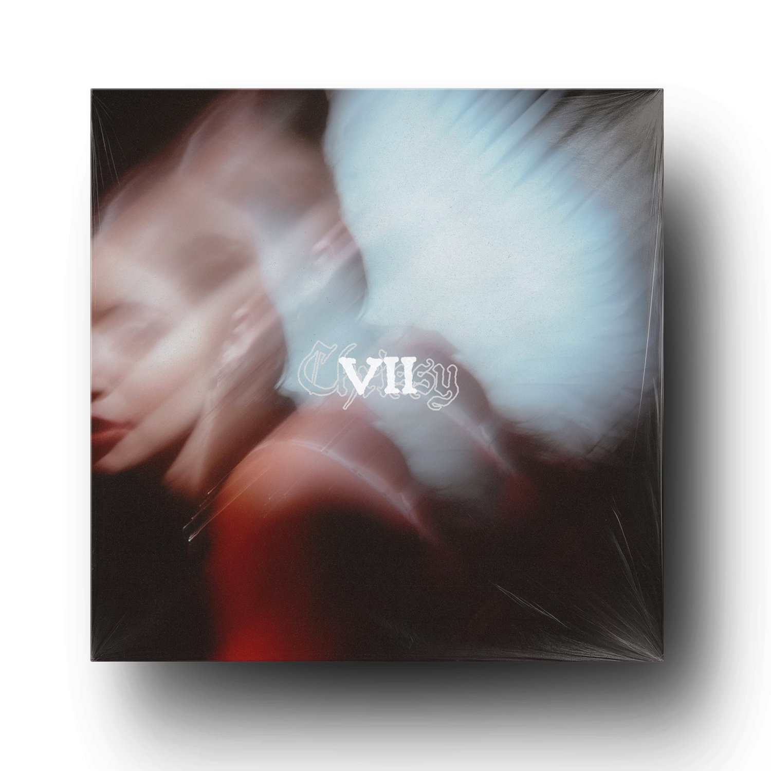
EP CD
When designing Chrissy’s EP cover and CD, my primary goal was to elevate the artistry and abstraction, setting it apart from the more gritty, punk-inspired visuals of Against The Current.
For ATC, our design approach leans literal and raw, but for Chrissy’s solo work, I wanted to fully embrace her fantasy-driven world—allowing for softer, more ethereal concepts with an intentional sense of mystery.
CANVASesvisualizers